
HOTSTREAK
A Tokenized Design System that Supports Light & Dark Modes
I spearheaded the creation of HotStreak’s first scalable, tokenized design system. As the sole designer, I built a shared visual language with our developer to support both light and dark modes, accelerating our shipping speed while making the app more accessible for users.
I spearheaded the creation of HotStreak’s first scalable, tokenized design system. As the sole designer, I built a shared visual language with our developer to support both light and dark modes, accelerating our shipping speed while making the app more accessible for users.
To respect NDA guidelines, designs have been slightly modified.
To respect NDA guidelines, designs have been slightly modified.
ROLE
ROLE
Founding UX/UI Designer
Founding UX/UI Designer
SKILLS
SKILLS
Tokenized Design Systems, Branding
Tokenized Design Systems, Branding
Context & Problem
I joined the startup during its early stages, when the product had no internal design system. Over my first few weeks, I balanced redesigning legacy screens with planning for upcoming feature pipelines. While managing both, I uncovered the following friction points:
I joined the startup during its early stages, when the product had no internal design system. Over my first few weeks, I balanced redesigning legacy screens with planning for upcoming feature pipelines. While managing both, I uncovered the following friction points:
I joined the startup during its early stages, when the product had no internal design system. Over my first few weeks, I balanced redesigning legacy screens with planning for upcoming feature pipelines. While managing both, I uncovered the following friction points:
UI Drift & Inconsistencies
The app lacked visual standardization as new features were shipped. Core components appeared in different colors, and a mix of typography was scattered across different flows.
UI Drift & Inconsistencies
The app lacked visual standardization as new features were shipped. Core components appeared in different colors, and a mix of typography was scattered across different flows.
The Designer-Developer Gap
There was no shared language between design and engineering. This created inefficient back-and-forth communication regarding usage and component states.
The Designer-Developer Gap
There was no shared language between design and engineering. This created inefficient back-and-forth communication regarding usage and component states.
Accessibility-Driven Demand
During initial user interviews, players requested a dark mode. For a data-heavy DFS app, a dark UI wasn't just a preference, it was a necessity to reduce eye strain.
Accessibility-Driven Demand
During initial user interviews, players requested a dark mode. For a data-heavy DFS app, a dark UI wasn't just a preference, it was a necessity to reduce eye strain.
Brand Alignment Gap
The product lacked alignment with the identity it wanted to scale. The system needed to directly anchor the UI around being electric but not loud, and active but not annoying.
Brand Alignment Gap
The product lacked alignment with the identity it wanted to scale. The system needed to directly anchor the UI around being electric but not loud, and active but not annoying.
The Constraint: As the only designer, I couldn't pause feature work for months to build a massive library. I had to design and ship live product updates while simultaneously building the engine behind them.
The Constraint: As the only designer, I couldn't pause feature work for months to build a massive library. I had to design and ship live product updates while simultaneously building the engine behind them.
The Constraint: As the only designer, I couldn't pause feature work for months to build a massive library. I had to design and ship live product updates while simultaneously building the engine behind them.
My Goal
Introduce a lean, WGAC-compliant, tokenized design system into an agile startup environment without halting product feature delivery.
Process
Defining Core Principles
Before delving in, a few principles had to be established to guide my design choices.
Defining Core Principles
Before delving in, a few principles had to be established to guide my design choices.
Defining Core Principles
Before delving in, a few principles had to be established to guide my design choices.
1. Bold & Dynamic
Leverage a bold, flexible color palette that excels in both light and dark modes to capture attention.
2. Contrast & Clarity
Prioritize readability by implementing intentional typographic choices that make navigation intuitive.
3. User-Centric
Use cohesive design elements to create a seamless experience that resonates with sports gamers.
Owning Our Signature Color
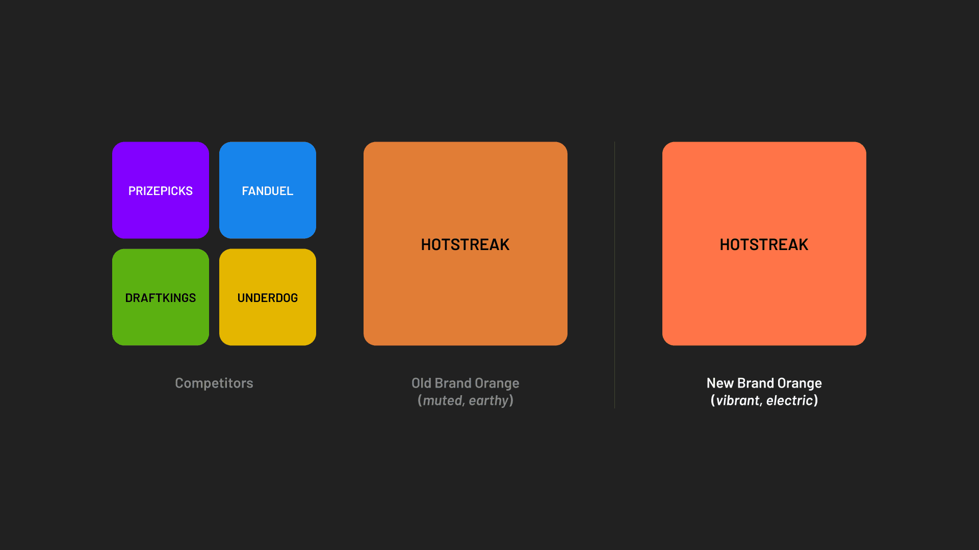
After analyzing the sports gaming landscape, we preserved orange as our primary brand color to maintain a distinct competitive edge. To elevate the energy to match HotStreak's face-paced gaming experience, I enhanced our core orange to be noticeably bolder and vibrant, pushing the saturation and hue closer to an electric reddish-orange.
Owning Our Signature Color
After analyzing the sports gaming landscape, we preserved orange as our primary brand color to maintain a distinct competitive edge. To elevate the energy to match HotStreak's face-paced gaming experience, I enhanced our core orange to be noticeably bolder and vibrant, pushing the saturation and hue closer to an electric reddish-orange.
Owning Our Signature Color
After analyzing the sports gaming landscape, we preserved orange as our primary brand color to maintain a distinct competitive edge. To elevate the energy to match HotStreak's face-paced gaming experience, I enhanced our core orange to be noticeably bolder and vibrant, pushing the saturation and hue closer to an electric reddish-orange.
Generating Primitive Values
To align with our brand voice and core principles, I anchored our primary color palette around the new, striking orange, ensuring it maintained a strong visual contrast in light and dark modes. I also selected Barlow font family for it's versatility, readability, and athletic personality, moving away from SF Pro used in previous designs.
I sped up the process by using generators (Typescale, Material Palette) to establish our initial type and color scales, then treated these raw properties as our primitive values to start.
Generating Primitive Values
To align with our brand voice and core principles, I anchored our primary color palette around the new, striking orange, ensuring it maintained a strong visual contrast in light and dark modes. I also selected Barlow font family for it's versatility, readability, and athletic personality, moving away from SF Pro used in previous designs.
I sped up the process by using generators (Typescale, Material Palette) to establish our initial type and color scales, then treated these raw properties as our primitive values to start.
Generating Primitive Values
To align with our brand voice and core principles, I anchored our primary color palette around the new, striking orange, ensuring it maintained a strong visual contrast in light and dark modes. I also selected Barlow font family for it's versatility, readability, and athletic personality, moving away from SF Pro used in previous designs.
I sped up the process by using generators (Typescale, Material Palette) to establish our initial type and color scales, then treated these raw properties as our primitive values to start.

Establishing Semantic Naming
I audited the app for common patterns, then started building the semantic token system in Figma: core typography, colors, and spacing. I structured the naming convention to transition from primitive global values down to functional semantic layers (e.g. text, background, and buttons). I kept it simple to start, while ensuring it could scale to support future modifiers, like web hover states.
Establishing Semantic Naming
I audited the app for common patterns, then started building the semantic token system in Figma: core typography, colors, and spacing. I structured the naming convention to transition from primitive global values down to functional semantic layers (e.g. text, background, and buttons). I kept it simple to start, while ensuring it could scale to support future modifiers, like web hover states.
Establishing Semantic Naming
I audited the app for common patterns, then started building the semantic token system in Figma: core typography, colors, and spacing. I structured the naming convention to transition from primitive global values down to functional semantic layers (e.g. text, background, and buttons). I kept it simple to start, while ensuring it could scale to support future modifiers, like web hover states.

Testing Color Values
I used the Stark plugin to check for accessibility. I designed in light mode first before testing in dark mode, using simpler screens to catch contrast issues, like needing lighter text values for dark mode, before dealing with complex layouts. This approach allowed me to validate our designs and establish a lean, robust set of semantic tokens that scaled cleanly into our components.
Testing Color Values
I used the Stark plugin to check for accessibility. I designed in light mode first before testing in dark mode, using simpler screens to catch contrast issues, like needing lighter text values for dark mode, before dealing with complex layouts. This approach allowed me to validate our designs and establish a lean, robust set of semantic tokens that scaled cleanly into our components.
Testing Color Values
I used the Stark plugin to check for accessibility. I designed in light mode first before testing in dark mode, using simpler screens to catch contrast issues, like needing lighter text values for dark mode, before dealing with complex layouts. This approach allowed me to validate our designs and establish a lean, robust set of semantic tokens that scaled cleanly into our components.


Prioritizing High-Impact Components
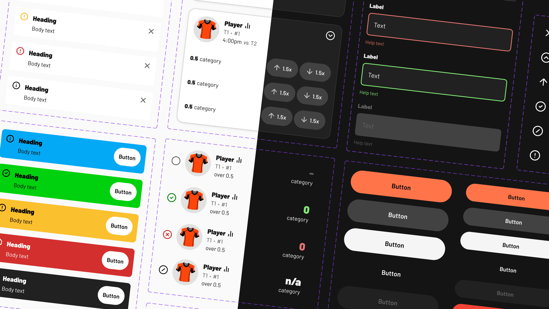
Designing every element from scratch would take too much time, so I outsourced certain components like iconography to a library (Lucide). This freed me up to design product-specific components that users would see the most, like player cards, avatars, alerts, and banners, that were easily swappable and added a custom feel to the app.
Prioritizing High-Impact Components
Designing every element from scratch would take too much time, so I outsourced certain components like iconography to a library (Lucide). This freed me up to design product-specific components that users would see the most, like player cards, avatars, alerts, and banners, that were easily swappable and added a custom feel to the app.
Prioritizing High-Impact Components
Designing every element from scratch would take too much time, so I outsourced certain components like iconography to a library (Lucide). This freed me up to design product-specific components that users would see the most, like player cards, avatars, alerts, and banners, that were easily swappable and added a custom feel to the app.

Results
Improved Developer Handoff: Because the system was built with a shared language, continuous follow-up questions about color, typography, and states decreased dramatically.
Faster Product Shipping: We could spin up new screens in both modes and iterate exponentially faster with the foundational building blocks already set.
Increased Accessibility: Within the initial launch phase, the implementation of the dark mode instantly improved readability.
Improved Developer Handoff: Because the system was built with a shared language, continuous follow-up questions about color, typography, and states decreased dramatically.
Faster Product Shipping: We could spin up new screens in both modes and iterate exponentially faster with the foundational building blocks already set.
Increased Accessibility: Within the initial launch phase, the implementation of the dark mode instantly improved readability.
Improved Developer Handoff: Because the system was built with a shared language, continuous follow-up questions about color, typography, and states decreased dramatically.
Faster Product Shipping: We could spin up new screens in both modes and iterate exponentially faster with the foundational building blocks already set.
Increased Accessibility: Within the initial launch phase, the implementation of the dark mode instantly improved readability.
~3x
~3x
~3x
Faster Design Speed
Faster Design Speed
Faster Design Speed
100%
100%
100%
WCAG AA Compliance
WCAG AA Compliance
Takeaways
Progress Over Perfection: While building my first tokenized design system, I had to remember not to let perfection be the enemy of completion. I knew that as the company evolved, so would the design system, serving as a living document meant to be iterated on and refined.
Prioritizing What Matters: Being a solo designer at a fast-moving startup means you have to be wise with your time. Using type and color generators and outsourcing standard assets like icons allowed me to spend my energy where it actually impacted the user experience.
Token Systems Save Time: Investing the time upfront to build a tokenized system felt daunting at first, but the payoff in speed and consistency was immediate. Because I established our semantic tokens early on, scaling the interface to be responsive across both mobile viewports and web platforms was seamless.
Progress Over Perfection: While building my first tokenized design system, I had to remember not to let perfection be the enemy of completion. I knew that as the company evolved, so would the design system, serving as a living document meant to be iterated on and refined.
Prioritizing What Matters: Being a solo designer at a fast-moving startup means you have to be wise with your time. Using type and color generators and outsourcing standard assets like icons allowed me to spend my energy where it actually impacted the user experience.
Token Systems Save Time: Investing the time upfront to build a tokenized system felt daunting at first, but the payoff in speed and consistency was immediate. Because I established our semantic tokens early on, scaling the interface to be responsive across both mobile viewports and web platforms was seamless.
Progress Over Perfection: While building my first tokenized design system, I had to remember not to let perfection be the enemy of completion. I knew that as the company evolved, so would the design system, serving as a living document meant to be iterated on and refined.
Prioritizing What Matters: Being a solo designer at a fast-moving startup means you have to be wise with your time. Using type and color generators and outsourcing standard assets like icons allowed me to spend my energy where it actually impacted the user experience.
Token Systems Save Time: Investing the time upfront to build a tokenized system felt daunting at first, but the payoff in speed and consistency was immediate. Because I established our semantic tokens early on, scaling the interface to be responsive across both mobile viewports and web platforms was seamless.
Connect to Content
Add layers or components to infinitely loop on your page.
Connect to Content
Add layers or components to infinitely loop on your page.
Connect to Content
Add layers or components to infinitely loop on your page.
Let's chat!
Feel free to reach out if you want to learn more. :)
Ginalyn Mina © 2026
Connect to Content
Add layers or components to infinitely loop on your page.
Connect to Content
Add layers or components to infinitely loop on your page.
Connect to Content
Add layers or components to infinitely loop on your page.
Let's chat!
Feel free to reach out if you want to learn more. :)
Ginalyn Mina © 2026
Connect to Content
Add layers or components to infinitely loop on your page.
Connect to Content
Add layers or components to infinitely loop on your page.
Let's chat!
Feel free to reach out if you want to learn more. :)
Ginalyn Mina © 2026